
Snow. Can you envision everything covered in blindly beautiful white snow? Does it make you see how quiet the world can be? Does it give you a sense of wonder, transporting you to a fantasy world, making you want to explore every nook and cranny? Are the textures of the ice and snow not amazing? You never know exactly what form the ice will make, though it follows a generally predictable pattern. But all the same, it’s shiny, like diamonds in the sky at night. It’s smooth yet it can have jagged edges. Like wallpaper, it forms patterns of the world. And the snow. It can be powdery and light, like the powdered sugar that you need for the delicious icing on the cake. It’s light, like a blanket covering the ground, lulling us to sleep. Sometimes the sturdier stuff is better, like for sledding on and making snowmen, much like cookie dough where you could make it your own.
Color Therapy

Color Therapy: Lemon Yellow

When I think of the word “lemon yellow,” I think of the word “happy.” It’s a very cheerful color. Synonymous with the sun. We’re all happier on a sunny day. I think of lemon yellow as a summer color, although by taking very extra care, it could be an early fall color. Now that Hurricane Hermione is gone, it feels like fall is here, though I can still feel some of the summer heat.
Share this:

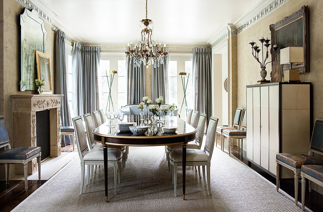
Color Theory: Gray and Cream
Gray and Cream. I’ve never really been a fan of that color palate. It’s a little too neutral for me, though a perfect opportunity to amp up your texture skills. Yet oddly enough, I woke up one morning and realized that I had that palette in a couple of places in my apartment. I had a creamy cabinet against gray walls and creamy pillows on my gray couch. I assure you, this was purely accidental. I had my creamy cabinet before moving into the apartment that came with gray walls and I had my creamy pillows well before we bought the gray couch.
Well, the damage is done now. My curiosity was piqued and I decided to explore how some rooms were decorated with this color palette.
Share this:

Color Therapy: Lavender
I tried to do good research. Really, I did. It just appears that the color, Lavender, is almost a rather boring color, though beautiful. Its history seems be as soothing as its namesake flower. It does not seem to have played in any major part in the trading industry, like the indigo did, and it wasn’t a lethal color like emerald once was. Basically, it’s just part of the purple family, which has been a color choice for royalties. And that was mainly because back in the day only royalties could afford the purple dye, which was made from snails.

Via Pinterest and Benjamin Moore
Share this:

Color Therapy: Emerald
In honor of the upcoming St. Patrick’s Day, I wanted to talk about Emerald. Green is my second favorite color, as long as it’s not lime. I’m actually not a huge fan of green with a yellow undertone to it. But I love emerald, kelly green, pine green, mint green, and well, I could on. But, I won’t. Read on to see what Emerald does to my imagination.

Emeralds are the birthstones for May.

